
A big congrats to the winner of last week's challenge: Karen Russell!

I loved everything about this card: The primary colors are subtle but fabulous, the faded sponging of the journalling spot is gorgeous, the sanding of the cardstock to match the B&T is a beautiful effect, and the embossing of the bird and the addition of the Baker's Twine are just the right touch! Great job, Karen!
Ruth's Pick: Lalia Harris!
Franny's Pick: Jody Gustafson!

This week's color dare is to choose your own secondary colors: any shade of orange, green, and/or purple will do. Pick two or use all three.

This is a design from Vicki Wizniuk at wizardshangout.blogspot.com. She has these cards for sale. I changed up the colors, but otherwise it is the same. I used Bohemian Alphabet in Sunset, the flowers are also from Bohemian Alphabet. They are stamped in Amethyst. The sentiment is from Little Reminder - stamped in Gypsy. I used the Sunset polka-dot pattern from Dotty for you, the textured circles from Dotty for You for the heart (cut on AP), and Sweet Leaf grosgrain ribbon.
Lesson: When you use secondary colors together, it usually lends to a bright and cheerful look. If you want to go more subdued, use a tint, tone, or shade (we'll talk more about those at a later date), or only use 2 colors. If you use all three, use one for your main color, the second as a secondary color, and accent lightly with the third color.
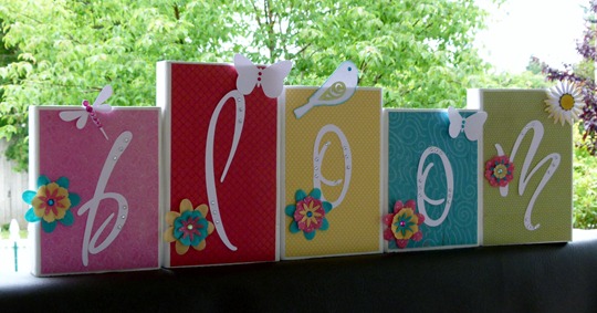
Ruth made a beautiful banner for her daughter using Sweet Leaf and Amethyst.

Franny made a card using Sonoma. This design is taken from Allisa Chilton at rockymountainpapercrafts.blogspot.com. The colors are Olive and Smokey Plum with Petal and Amethyst. She used Bamboo as her neutral, and the sentiment is stamped from A Little Thanks. Didn't she do a great job?


Bonus Points: You will get bonus points this week as for every week if you use 100%, current Close to My Heart Products. To get more bonus points, go find your muse! Look at the blog of someone whose artwork you admire, and let one of her pieces inspire you.
Here's what you do: Create a project using the provided colors, take a picture of it, post it to your blog, then link it up at the bottom of this page. Just leave a comment with your link if you have trouble linking. You must use something from CTMH, but it doesn't have to be completely CTMH. Have fun!


 There are 3 primary colors: red, yellow, and blue. When you mix the primary colors, for example: yellow and blue or blue and red, you get secondary colors. The secondary colors are green, orange and purple. Then, when you go even deeper, you can mix the secondary colors with the primary colors. This week we are focusing on primary and secondary colors. These colors are very pleasing to the eye when placed in this order: red, orange, yellow, green, blue, and purple. This is the order of the colors in a rainbow. (I love rainbows because they are God's promise to us that he will never flood the earth again.)


