Friday, July 27, 2012

Color Dare #9 - Creme Brulee & Petal

Hi! Welcome to the Color My Heart color dare - the only color challenge using Close to My Heart's exclusive color palette!

I've decided to add the colors to the post title, so no one will get confused as to which colors are to be used for the current color dare. I realize that I will have to change the blog's title heading because just about all of those colors will be retired as of August 1st. LOL.

Congrats to last week's winner of the tints challenge: Marie Flayer! I just love how the cardstock compliments the stamped images!


Franny's choice: Annette Clark


Ruth is out of town. We miss her  :(

This week's color dare is:
Petal
Creme Brulee
I've been working with Avonlea (and Clementine, and Scholastic, and Pear and Partridge, and Flirty) and so I took inspiration from the Avonlea Workshop on the Go. I got this sketch from Freshly Made Sketches. I love their idea of keeping the lines clean. I especially like DT member (and fellow CTMH consultant) Allisa Chilton's work. I like to case her whenever I can because I like her style. It's very "me." :) I will be giving bonus points for using a sketch from Freshly Made (this week's or any week.)

Materials used:
Paper: Slate, Creme Brulee, and Colonial White cardstock, Elemental Level 2 pack
Stamps: Avonlea Workshop on the Go
Inks: Slate, Petal
Other: Slate Organdy Ribbon, Slate Epoxy Bubbles (both from Avonlea Card WOTG), Color Ready Seam Binding Ribbon

Lesson: Today's lesson is "Tints, tones, and shades, part 2- tones." A tone is when grey is added to a color to tone it down a little. CTMH has many colors that are tones; this is because tones are more pleasing to the eye. I chose complimentary colors again for our tones, this time yellow and purple. This will be the last time we will use Petal in a dare because it will be retiring. Say goodbye.

Here is Franny's card:
Franny used Chocolate as her base and ink, a piece of polka-dotted Dotty for You paper as her Creme Brulee, and Petal as her middle circle. She embellished with pearls. Very pretty, Franny!

 
Here is a beautiful card from last week's winner, Lynn Darda!
Lynn used the stamp set Sweet Moments, and she colored the seam binding ribbon Petal to match. I love the look of these two colors on the Colonial White background. Lovely!

Here's what you do: Create a project using the featured colors. You must use Close to My Heart (CTMH) products to participate, but you may use other products as well. You will get bonus points if you use 100%, current CTMH products! Your project can be anything as long as there is paper in it. Examples are: scrapbooking layouts, cards, 3D items, altered items, ect. You may combine as many challenges as you want, but please make sure you use only the colors in our challenge. Feel free to add any neutrals in our color palette to your project.

Take a photo of your project, upload it to your blog or online gallery, and link your post up here. You must provide a link to your post, not just to your blog in general. Please include a link to our site and our challenge photo on your blog post. You have until Thursday @ 8PM to link your work. Thanks so much, and have fun!

Thursday, July 26, 2012

Color Dare #8 Entries

Very cheery projects, ladies! Great job!

Annette Clark


Wendy Coffman


Lynn Darda


Amie Kiger


Marie Flayer


Jody Gustafson

Friday, July 20, 2012

Color Dare # 8

Hi and welcome back to Color My Heart color dare. It's great to have you. Sorry I had to be gone for a week, but I took a week of vacation after Convention. I'm still on vacation, but I will be back and going next week.

Congratulations to last week's winner: Lynn Darda!

Ruth's choice: Jody Gustafson!
Franny's choice: Lela N!
This week's color dare is:
Sky
Pear
Smoothie
Materials used:
Paper: Kraft Die Cut Card
Stamps: Card Chatter - Love
Inks: Pear, Sky, Smoothie
Other: Persnickety Journaling Spots, Dimensional Elements Hearts, Smoothie Baker's Twine

Lesson: When you add white to any hue, it lightens the color and it is called a tint or a pastel. These colors are bright pastels. These shades in relation to each other are called "split complimentary." This is when one color is combined with 2 colors on each side of the first color's compliment. In this case it is red, (green is red's compliment), green blue and green yellow.

Here is Franny's card:
Franny used Dotty for You paper that had Smoothie in it. She cut out the flowers in various shapes and sizes with AP, and stamped them with the Hooray Bouquet stamp set. The sentiment is also from Hooray Bouquet. I just love the layering on this card!

I'm giving bonus points this week if you find inspiration on Janette's blog. I actually found this color combo on her blog from a post about 2 years ago.

Here's what you do: Create a project using the featured colors. You must use Close to My Heart (CTMH) products to participate, but you may use other products as well. You will get bonus points if you use 100%, current CTMH products! Your project can be anything as long as there is paper in it. Examples are: scrapbooking layouts, cards, 3D items, altered items, ect. You may combine as many challenges as you want, but please make sure you use only the colors in our challenge. Feel free to add any neutrals in our color palette to your project.

Take a photo of your project, upload it to your blog or online gallery, and link your post up here. You must provide a link to your post, not just to your blog in general. Please include a link to our site and our challenge photo on your blog post. You have until Thursday @ 8PM to link your work. Thanks so much, and have fun!

Wednesday, July 18, 2012

Color Dare #7 Entries

Here are the secondary color entries. Very pretty, ladies! I have had a busy week, but I will have the new color dare up on Friday (Lord willing)! Enjoy:

Joanne Barnes

Jody Gustafson

Jody Gustafson #2


Marie Flayer

Karen Russell

Caroline B.

Marie Flayer #2


Lela N.

Diana Mathieson


Lynn Darda


Amie Kiger

Lela N. #2


Casandra Bennett


Rebecca Kings

Thursday, July 12, 2012

Convention

Greetings from Dallas, Texas! I am having a blast here at convention. But I am dead tired. I thought I would be able to post this new color dare, but I'm having trouble staying awake. So I'll give you a quick update, and I'll try to post tomorrow or Saturday.

Today we got our Fall/Winter 2012 Idea Books. We have some great new products coming out including alcohol based markers, a new Cricut cartridge, fun home decor items and new card and home decor Workshops on the Go. But the most important thing is the updates to our color pallette! It will be a challenge for me on this blog, but I always love a challenge. If you have any specific questions about new products or Convention, just leave me a comment and I'll give you more details!

See you later

Sarah

Friday, July 6, 2012

Color Dare #7

Thanks for joining us this week at Color My Heart. Thanks to the 13 entries we had last week. They were so creative - you can scroll down to the previous post to check them out! And thanks to the 111 followers we have so far!

A big congrats to the winner of last week's challenge: Karen Russell!

I loved everything about this card: The primary colors are subtle but fabulous, the faded sponging of the journalling spot is gorgeous, the sanding of the cardstock to match the B&T is a beautiful effect, and the embossing of the bird and the addition of the Baker's Twine are just the right touch! Great job, Karen!

Ruth's Pick: Lalia Harris!
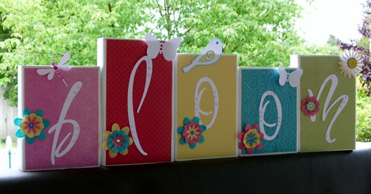
bloom blocks CTMH Art Philosphy Lucy Stella Dotty Footloose

Franny's Pick: Jody Gustafson!


This week's color dare is to choose your own secondary colors: any shade of orange, green, and/or purple will do. Pick two or use all three.

This is a design from Vicki Wizniuk at wizardshangout.blogspot.com. She has these cards for sale. I changed up the colors, but otherwise it is the same. I used Bohemian Alphabet in Sunset, the flowers are also from Bohemian Alphabet. They are stamped in Amethyst. The sentiment is from Little Reminder - stamped in Gypsy. I used the Sunset polka-dot pattern from Dotty for you, the textured circles from Dotty for You for the heart (cut on AP), and Sweet Leaf grosgrain ribbon.

Lesson: When you use secondary colors together, it usually lends to a bright and cheerful look. If you want to go more subdued, use a tint, tone, or shade (we'll talk more about those at a later date), or only use 2 colors. If you use all three, use one for your main color, the second as a secondary color, and accent lightly with the third color.

Ruth made a beautiful banner for her daughter using Sweet Leaf and Amethyst.

Franny made a card using Sonoma. This design is taken from Allisa Chilton at rockymountainpapercrafts.blogspot.com. The colors are Olive and Smokey Plum with Petal and Amethyst. She used Bamboo as her neutral, and the sentiment is stamped from A Little Thanks. Didn't she do a great job?


Here is Shelly Nemitz's beautiful layout. She was our winner last week. Isn't this gorgeous? Shelly's main color was topiary, and her secondary colors were Suset and Goldrush. Then she accented with Petal. Her layout goes so well with her pictures, doesn't it?

Bonus Points: You will get bonus points this week as for every week if you use 100%, current Close to My Heart Products. To get more bonus points, go find your muse! Look at the blog of someone whose artwork you admire, and let one of her pieces inspire you.

Here's what you do: Create a project using the provided colors, take a picture of it, post it to your blog, then link it up at the bottom of this page. Just leave a comment with your link if you have trouble linking. You must use something from CTMH, but it doesn't have to be completely CTMH. Have fun!

Thursday, July 5, 2012

Color Dare #6 Entries

Annette Clark - Lucy with Petal

Shelly Nemitz - Florentine with Tulip

Joanne Barnes Dotty for You with Moonstruck

Amie Kiger - Footloose with Sunset


Karen Russel Footloose with Tulip and Buttercup


Dorothy Seiler - Pemberly with Creme Brulee and Olive


Cassandra Bennett - Pemberly with Cranberry


Diana Mathieson - Pemberly with Pear


Jody Gustafson - Elemental with Hollyhock

SOTM butterfly card CTMH outside LUCY
Lalia Harris - Lucy with Lagoon

bloom blocks CTMH Art Philosphy Lucy Stella Dotty Footloose
Lalia Harris - Lucy with Stella, Footloose, and Dotty for You


Lori Brown - Mischief with Tulip


Lori Brown - Dreamin' with Sorbet

Lela N. - Florentine with Barn Red